Nov 20, 1985
First commercial release (or close enough.)
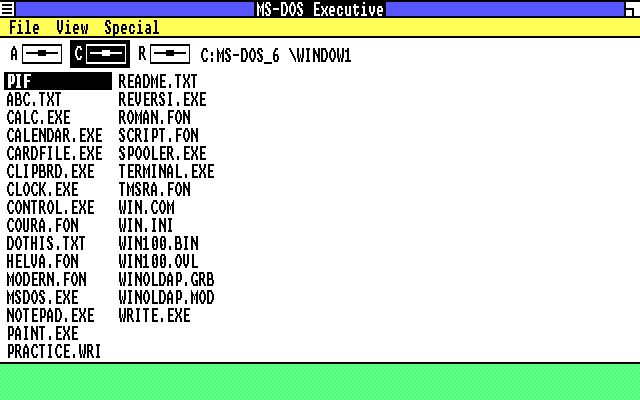
Explorer had not been coined yet; this is MS-DOS Executive.
Very simple interface. You can see basically everything it does.
Explorer had not been coined yet; this is MS-DOS Executive.
Very simple interface. You can see basically everything it does.
May 27, 1988
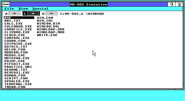
Basically identical except for screen dimensions. This version
of Windows has overlapping windows but you can't open multiple
Executive windows.
May 22, 1990


First version of Windows where the file explorer is a discrete
application you can either close completely or open multiple instances
of. It's called File Manager for the next several
years.
This version is still visually very similar to the Windows 2.x file explorer. The root window, Directory Tree, retains the 2.x drive selector, and you can't duplicate this window. However, it now displays a tree view that didn't exist in 2.x, and only shows folders.
To see files you need to select a folder or disk to get a folder view, of which you can have many. You can't see it in this particular shot, but the folder view displays a virtual .. object for going up one directory.
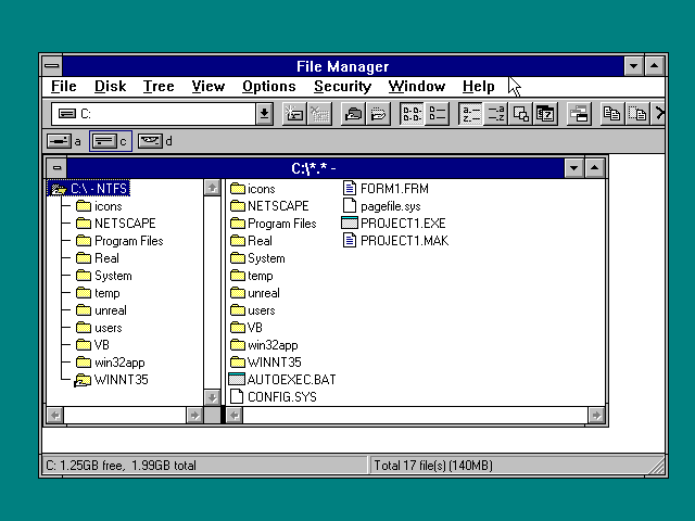
Apr 6, 1992


A significant revamp, introducing the two-pane
view that would become available in every future version of
Windows. This essentially combines the Directory Tree
with the file view, which is certainly useful, but it's interesting what
they've changed here.
First, opening folders doesn't open new windows; they open in the current view, although you can request a new window from the menu if desired. It would remain this way until Windows 95 brought back the 3.0 behavior.
Second, folders in the tree view no longer show + or - symbols by default (it's turned on in the screenshots). This was a standard feature in 3.0 that told you whether a folder in the tree view had more folders under it. You can toggle this back on from a menu, but I guess they figured it was visually noisy as a default.
Also note in the second screenshot that windows can be switched to directory-only view, with no tree at all, or to tree-only view.
Oct 1992

While Win 3.11 was a minor delta from
Win 3.1,
Windows For Workgroups 3.1 made a number of significant
changes regarding networking. The primary impact on File Manager
however was the introduction of a toolbar that substantially alters
its look, if not its function.
The toolbar offers a disk selector combo box, which is almost completely redundant to the Win 1-era disk selector except that it displays the disk label. I'm not really sure why they kept the old-style one if they were adding this. This gets even wackier when you find the Select Disk option in the menu.
The buttons on the toolbar are all redundant to options in the menus, so this is nothing revolutionary except that in 1993 I think Microsoft was just getting hot for toolbars.
My understanding is that if I had the network stack working there would be some network commands on that toolbar, but I can't confirm that, and I assume they would have been in the menus anyway.
July 27, 1993

When I first learned there was an NT 3.x, I only
knew about 3.51, and even after I learned 3.1
came out I had been under the impression that it was only out for a
moment before 3.51 hit the market. It turns out this is
completely false; 3.1 is from 1993, there was a
3.50 in 1994, and 3.51 was in 1995.
3.1 inherits the File Manager from WFW 3.11, not surprisingly since you can see the aforementioned buttons for mapping network drives. I wonder if WFW was essentially a dry run for "networking in Windows" as they ramped up to the NT release?
There's also a button for permissions which is offscreen here.
Sep 21, 1994

3.50 is essentially identical to 3.1. I
include it because I'd already taken the screenshot before I realized
there was really nothing to distinguish it.
May 30, 1995
There is no significant delta between 3.1/3.50
in 3.51, except that the buttons on the toolbar are now
rendered in the 95 style.
The behind the scenes explanation for this that I've been given is that the purpose of 3.51 was an urgent update to get support for the APIs of the upcoming Windows 95 into NT, since the release of the next major version, NT 4, wouldn't be until 1996.
To which degree this is responsible for the changed buttons is an intriguing question for me. Obviously the other common controls like menubars and scrollbars have not changed, and in my experience when running apps from 3.x on 95 those controls do update. I suppose this could be an unfinished version of the 95 UI updates.
Aug 24, 1995

Needless to say this is the
Big Wallop, the
Great Uplift, the
Grand Remake, except... Well,
it's not that Grand, they just kinda turned some things around.
Despite the new name, Explorer is not that deeply altered from
File Manager.
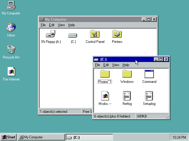
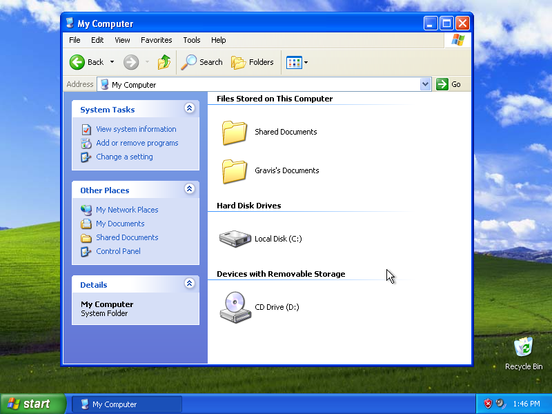
The default folder view is extremely plain. We have lost most of Windows 3.1's File Manager. We've not only lost the semi-unnecessary toolbar, we've lost almost everything. When you open My Computer you see absolutely nothing other than your disks, Control Panel, and Printers. This is an intriguing moment in Windows history. To put it colloquially, we have lost the dot-dot.
This is an important conceptual point so I'm going to groove on it for a while.
From the beginning of the PC, your interface to the system was two dimensional. At any given moment you had three actions available: look at files that are at your level, descend down a level, into the hierarchy, or go up a level out of the hierarchy.
In DOS, you could type CD .. at any time to go up, to the parent folder of your current location; all the way to the root of the disk. Windows 1, 2 and 3 all preserved this capability; they all offered the dot-dot. Look in the earlier screenshots and you'll see it in every folder. Notably, this was also present in most Unixes. Windows 95 has removed an entire direction of the compass rose from its default Explorer view.
In short, in the first screenshot, there is no way to go up. Search all you like, there's no way to do it. There's nothing on screen, nothing in the menus either. You might discover that backspace will do it, but this would be pure luck.
This mode is what a friend of mine refers to as Spatial Explorer - referred to as Spatial because it remembers where every folder was the last time you opened it. This mimics what MacOS was doing at the time, prior to the intrusion of NeXT's ideology. And, like MacOS, when you open a folder, the folder is instantly orphaned, separated from its parent. There's no way to go back from a folder once you've opened it except to keep the parent open. If you close the parent, you have to reopen the hard drive from the desktop and begin drilling down again. Unless you know about the backspace shortcut, at least.
I can't really comprehend why Microsoft thought this was a good idea unless they were simply directly trying to mimic MacOS, which similarly traps users in each folder they open. It is a significant decrease in functionality - we've not only lost the toolbar and disk selector from Win 3.1, we've lost an entire direction of navigation. In fact, they didn't think this was a good idea until very late in development - see this image (courtesy of ToastyTech) of a late 95 build where the .. is still present, as well as a "parent" option in the displayed menu that does the same thing.
What offended Microsoft about the dot-dot? I can't fathom what it could have been.
Even more strangely, while the stock configuration of Explorer is like this, you can go to the menu and turn on Toolbar, which restores the disk selector and a "go up" button, as you can see here. This gets us back to the 3.1 state of affairs, in which every folder view is self-sufficient instead of needing to be thrown away as soon as its gone too deep. I have to imagine that, with how barebones it is, a reasonable number of people searched around and discovered this.
Once the toolbar is enabled, Windows 95's explorer is essentially the same as the folder view from 3.1 File Manager, except that the tree view is missing. That looks a little novel until you discover that 95, for un-obvious reasons, introduces a second mode for Explorer, called... Explore.
If you right click on any folder and hit Explore you get the mode from the second screenshot. Compare this side by side with File Manager in 3.1.
If you focus on Explorer itself and tune out the new 3D window borders, the layout is not all that different. It has the split-pane with the tree on the left, the toolbar is nearly identical to WFW's except for two new buttons, there's a new status bar above the two panes, but by and large it's the same.
It's curious to me that Microsoft left this mode in but more or less hid it. You cannot "upgrade" a folder window to an Explore window, you have to right click on a folder and click Explore to create one. Unquestionably, tons of users never realized this was there. As you'll see, they realized before very long that it didn't make much sense to do this.
More important than the changes to the UI were the changes to the storage hierarchy. This, to me, is the big impact of Windows 95. From DOS onwards, Microsoft had treated file management as a dry depiction of the exact same disk/folder/file structure that stretched back to the first IBM PC (and arguably to S-100 systems that inspired it.)
Beginning with 95, Microsoft makes new assertions about the hierarchy. While file paths haven't changed (C:\Windows is still valid), Explorer is now used to make a strong statement about how Microsoft wishes you to perceive your computer.
Now disks are children of My Computer, which is not simply a link to open Explorer, but in fact a virtual location that contains your storage devices (among other things.) And even that is not the root of the storage hierarchy. The tree begins at Desktop. Indeed, you can see with your eyes that the object - "My Computer" - resides on your desktop.
With this change, Microsoft has asserted that your physical computer exists in a metaphysical space. Windows exists in another dimension, and has mapped your physical computer into its spacial awareness. Your computer sits alongside things like Network Neighborhood, where other computers live, and My Briefcase, which is literally a meta-representation of portable devices or storage media that exist outside of your computer.
So in essence Microsoft made very few direct changes to File Manager for 95, but made dramatic changes to the concepts of computing. I am working on an essay about the larger implications of this topic.
Aug 24, 1996


It's often said that NT4 was NT
with the 95 shell "dropped into" it - there are tons of
changes in functionality, naturally, so this is like when someone says they "slapped" a
new engine into their car despite the process taking four months of
grinding, fabricating adapters, etc. However, I think the images here
speak for themselves.
Explorer, as far as the distinct file browser itself goes, is absolutely indistinguishable from the version in 95. If you dig into dialogs you start finding things, but at a glance I do not believe it's possible to tell the difference between 95 and NT4.
The toolbar is disabled by default just like 95, I just turned it on before I took the screenshots. The stock NT4 Explorer is trapped in whatever folder it ends up in.
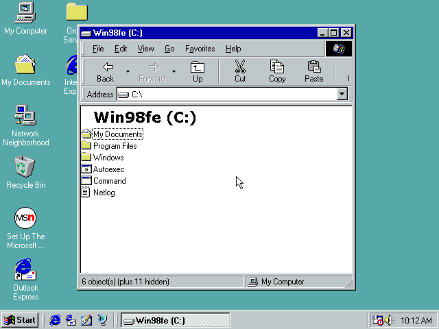
Jun 25, 1998


Windows 98 was famously
controversial, at least in nerd circles, for the integration of
Internet Explorer into Explorer itself, but again there's
very little alteration to the layout of the Explorer part of
Explorer. The icons now have higher color depth, which makes
them feel more spritely and alive, but otherwise the differences are
limited to having obtained the thicker IE toolbar, although
that can be turned off for the most part.
A new development is that the folder tree view can be toggled now from any window. You can still launch the Explore view separately however, and we can tell that this calls Explorer in some different way because the Tools menu only appears on windows launched via that method.
The toggle for the tree view is buried up in a menu, so still, many users may not have noticed this feature was available unless they happened to right click on a folder and noticed the Explore option.
I cannot for the life of me figure out what triggers it, but sometimes 98 will hide the colorful "web content" sidebar. When this happens, it actually does something fairly pleasant where it displays the folder title in big text at the top. I thought it might be caused by running in 16 color mode, but I've tried it in high-color mode and it still happens. I have never seen this happen before now.
May 5, 1999


There are no notable changes I can find in SE. I include it only because they changed
the throbber between First and Second Edition.
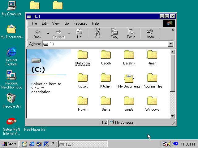
Feb 17, 2000

Windows 2000, if you
don't know, is where Windows lept in to the 20th century. But seriously,
folks,
2K and the associated NT5 kernel were leaps and bounds ahead of NT4 or the 9x branch. The improvements were myriad including a completely new graphics API but, again, Explorer remains mostly the same.
The new smaller toolbar comes from IE5.5 which had gained the side-labeled buttons at the same time, enabling the toolbar to shrink by 50%. The cut/copy/paste buttons have been shuffled forward however to make room for some new things.
A Search button - file search is now integrated into Explorer, which is reasonable on its face. A History button - more on that in a later edition. And finally, a Folders button, allowing the user to upgrade any window to Explore style with a tree view without needing to find it in a menu.
Probably the most significant addition to the main UI was just the hard disk space pie chart, but that's not a small feature frankly - it was extremely handy to not have to pull up Properties just to see how slammed your disk was. Microsoft had a neat idea here with putting quick info in their (otherwise useless) sidebar, but unfortunately it didn't quite play out.
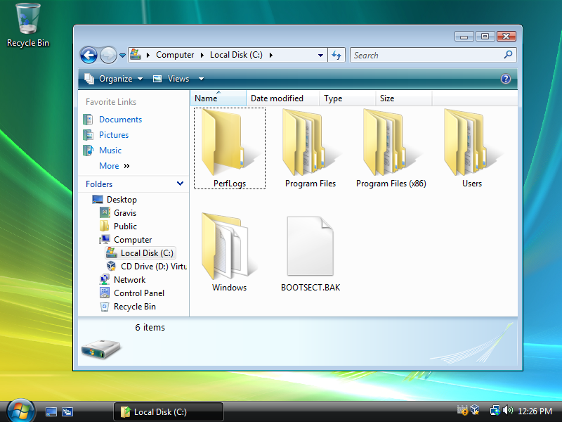
This is also the edition where Program Files began hiding itself behind a scare link, although that was somewhat sensible - software was by and large now being installed using apps that registered themselves with Add/Remove Programs, and Microsoft wanted to discourage users from deleting apps instead of using Uninstall. The warning message was also present in Windows 98 although it didn't require the user to acknowledge it in order to see the folder.
Finally, when in the root of My Computer (and a couple other places), the sidebar displays a See Also list as you can see in the second screenshot. This was the beginning of Microsoft's growing fascination with suggesting things to the user without any idea if the user wanted them, presumably in an attempt to diminish the confusing effects of growing UI complexity.
This was sort-of born in WFW3.11 with the addition of cut/copy/paste to the toolbar even though those options were available in menus or on the keyboard. The user was being shown options they hadn't asked after, but they were at least very common ones and they saved a click - a click into menus that had been growing for some time, at that.
2K and the associated NT5 kernel were leaps and bounds ahead of NT4 or the 9x branch. The improvements were myriad including a completely new graphics API but, again, Explorer remains mostly the same.
The new smaller toolbar comes from IE5.5 which had gained the side-labeled buttons at the same time, enabling the toolbar to shrink by 50%. The cut/copy/paste buttons have been shuffled forward however to make room for some new things.
A Search button - file search is now integrated into Explorer, which is reasonable on its face. A History button - more on that in a later edition. And finally, a Folders button, allowing the user to upgrade any window to Explore style with a tree view without needing to find it in a menu.
Probably the most significant addition to the main UI was just the hard disk space pie chart, but that's not a small feature frankly - it was extremely handy to not have to pull up Properties just to see how slammed your disk was. Microsoft had a neat idea here with putting quick info in their (otherwise useless) sidebar, but unfortunately it didn't quite play out.
This is also the edition where Program Files began hiding itself behind a scare link, although that was somewhat sensible - software was by and large now being installed using apps that registered themselves with Add/Remove Programs, and Microsoft wanted to discourage users from deleting apps instead of using Uninstall. The warning message was also present in Windows 98 although it didn't require the user to acknowledge it in order to see the folder.
Finally, when in the root of My Computer (and a couple other places), the sidebar displays a See Also list as you can see in the second screenshot. This was the beginning of Microsoft's growing fascination with suggesting things to the user without any idea if the user wanted them, presumably in an attempt to diminish the confusing effects of growing UI complexity.
This was sort-of born in WFW3.11 with the addition of cut/copy/paste to the toolbar even though those options were available in menus or on the keyboard. The user was being shown options they hadn't asked after, but they were at least very common ones and they saved a click - a click into menus that had been growing for some time, at that.
Sep 14, 2000

Windows ME again got the
appellation of "Windows 98 with the 2000
shell dropped into it," which is historically interesting only because
it shows the direction Microsoft's product lines had shifted - suddenly
NT was the line where new UI developments were being
made and 9x was getting hand-me-downs.
Explorer has made one significant leap in this release: Microsoft has decided to hide the entire hard drive from the user. I doubt this was well received by anyone (indeed, they removed it several releases later.)
Explorer has made one significant leap in this release: Microsoft has decided to hide the entire hard drive from the user. I doubt this was well received by anyone (indeed, they removed it several releases later.)
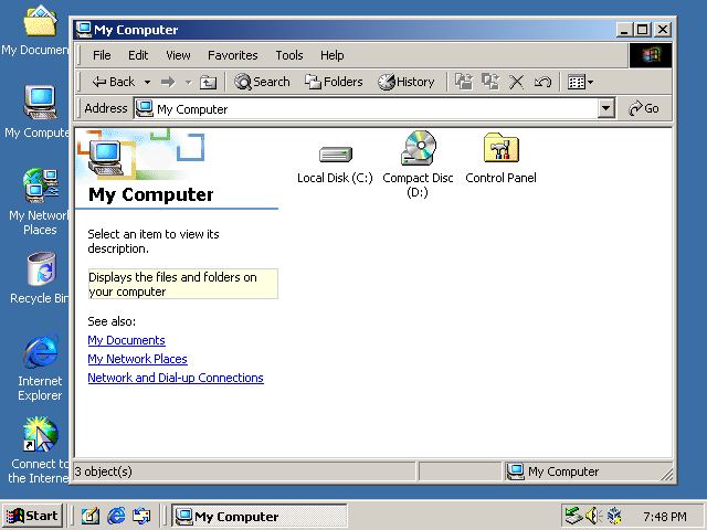
Oct 25, 2001
 <
<
Windows XP's Explorer brought some
interesting updates. Although the overall layout is the same, Microsoft
saw fit to finally remove the cut/copy/paste options that had been there
since WFW 3.11.
They also removed the History button. This is curious because they could have done it at any time - even in Windows 98 the toolbar automatically removed irrelevant buttons when switching from disk to web and back, and the History interface does not show local folders so it was definitely useless for file browsing.
I think this button may have remained because the Internet! Internet! Internet! brainworms of the 90s kept telling developers absurd lies like "users will be freely moving between local files and websites all the time, as if they were the same kind of data." This was probably the reason MS merged IE and Explorer to begin with, but by XP they had surely realized that not even power users converted Explorer windows to IE windows with any regularity.
By Vista, the ability to make this jump had been removed, and entering a URL in the Explorer address bar simply opened a browser. I'm sure there's a lot of shared code still (come on, it's MS) but functionally there's no longer any connection between IE and Explorer.
How many people recognize that the Great Explorer Merge that generated so much ill will had a beginning date and an end date? Did you?
Now, all the minor changes aside, in the non-Explore format the sidebar has grown enormously. Microsoft has gone much harder on the idea of suggested actions. XP begins your experience in My Computer by showing you links to the System control panel, Add/Remove Programs, and the Control Panel in general.
It's odd to guess that you might want to go to Add/Remove Programs from this point, but this is the first major step towards a goal of abstracting away the filesystem itself that Microsoft has slowly advanced towards since Windows 95.
The notion here was possibly something like: "the user shouldn't think in terms of accessing a file, but rather, opening a program, which is in the Start Menu. They shouldn't think in terms of deleting a program, but rather, uninstalling it. They shouldn't think in terms of opening a CD, because CDs should autoplay."
It gets weirder inside folders themselves. XP's Explorer has expanded the sidebar to the point where, at a typical resolution of the time (800x600), the sidebar actually has to be scrolled. For instance, I actually was about to write that Microsoft had curiously removed the file detail summary from the sidebar until I found that you have to scroll down to see it.
Although you can collapse these sections, they only stay collapsed until you close the window, so unless you get into the habit of collapsing them or scrolling down every time you open a window, you'll never be able to use that file details box conveniently. I feel it's significant that after 20 years of XP being out, and at least a decade using it as a daily driver, I had never realized the details were there.
My goal with this article is not to be highly opinionated, but one hobby horse I can't deny is that Microsoft made a terrible decision with this "common tasks" stuff. It can be summarized as "users won't use context menus, so we just display the context menu on the screen at all times and hope they notice it."
This has problems, the biggest of which is that the sidebar doesn't actually display everything that is in the context menu; also that the sidebar displays contextually inappropriate things; and also that context menus at this point were known to be baffling things stuffed with things most users didn't need. Unfortunately Microsoft only leaned into this design concept.
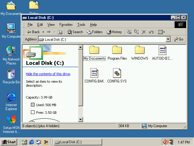
Nov 30, 2006

This is the big moment. Up until XP, Microsoft had
maintained a close connection to the file browser from the very
first release of their OS (this is a Microsoft tendency,) but here
is where it ended.
XP's Explorer is barely recognizeable as File Manager, but the stepping stones are there. Vista's Explorer is something totally new. I wouldn't be surprised if they literally began this codebase from scratch - opened a blank Visual Studio project and began typing.
This is actually what got me on this entire topic to begin with - I set up a VM with Vista for the first time in many years and was staggered to find that I'd forgotten completely that Vista's Explorer was considerably different from 7's. I mean, even glancing at it you'll go "wha, huh? it looked like that?"
In addition to the massive alterations made to the functionality of standard folder views, the big difference with this release is that the tree view has been supplanted (though not removed) by this new-world-Microsoft concept of quick access links and libraries.
The biggest change is that I couldn't figure out where the tree view had gone at first. When you open an Explorer window the only thing you have is the file view and the list of favorites.
Vista has no My Computer link on the desktop, nor an obvious one in the Start Menu. The most obvious way to open a folder view from its messy Start menu is to select something like Documents, and since the tree view is missing along with the "up one folder" button on the toolbar, you're actually unsure for a few seconds how to get to a hard drive.
It's a shocking experience, being thrown off balance this badly in what should be a familiar environment. It's just a learning experience, however, and I can't in good faith argue with that. My Computer has become simply Computer, and the tree view is still there - you just have to expand the Folder section in the sidebar.
Additionally, Explore is still here in the context menus, and still opens an Explorer with Folders already popped open. This is Explorer's last hurrah as an application divided against itself; in the next release, the Explore menu option is made redundant and disappears.
What's interesting about this is that it's not that Microsoft has diminished the significance of the sidebar tree view layout, it's just that they're again trying to redefine what the hierarchy of storage is.
Windows 95 asserted that your computer and its disks were children of the Desktop. This release does away with that and attempts to introduce a sort of Minority Report concept where you don't think about disks, or containers, you simply reach for your Documents or Pictures and the OS gets those from wherever they are, something they had already done with My Documents, but were leaning into. In this release it's just a bunch of quick shortcuts to user profile folders, and the move in the direction of abstraction would become more intense in Windows 7, but they were laying the framework here.
All this change with the sidebar is intriguing because, even as Microsoft diminished the value of the folder tree, they gave over the sidebar to what is essentially the evolution of their See Also suggestions.
Now, with the separation of IE, the sidebar will never become a history or favorites panel, and yet, the File Information field has been moved to a huge bar at the bottom and the context-sensitive task suggestions have moved to a strange toolbar/menu hybrid at the top, much thicker than a normal menubar. Perhaps these are technically better here, but they represent a greater encroachment on the primary purpose of the window.
Windows 1 showed your files in its entire view except for a menu and a list of disks at the top. Win 3 added a sidebar and a tiny status bar that doesn't do much to cramp the bottom. Vista however finally muscles in on a third side; now your file display is crushed between three dashboards of controls and information. It is my personal speculation that the average "just barely getting by" user became hopelessly lost the first time they looked at this. There is so much to learn and understand.
The sort order column headers from Detail mode show up even in icon mode. It's... I don't like it. It feels like the window failed to draw correctly. I don't think they ever did this again.
It's also worth mentioning that the default "large icon" size has become enormous, which I feel contributed to the feeling that I think many people had with Vista, that it was kind of a "toy OS." Yes, that's what many people felt about XP, and I understand why there too.
Suddenly everything was bigger, had larger margins, et cetera for no apparent reason, at the cost of actually being able to see your files. It was a strange choice. In this era, Microsoft seemed to simply irrationally hate "files."
Oct 22, 2009


Windows 7 was hailed by many as "Vista, but not bad"
and while there are mixed opinions on the validity of that, it's Explorer is,
I feel, a return to solid principles.
Firstly: Explore is dead, long live Explore. No, I didn't mistype Explorer - it's still here. But the Explore mode is gone.
You can no longer right click and hit Explore to open an explorer with a treeview, and Windows+E opens the exact same view as clicking on the Explorer button in the taskbar. And that's because, after a decade, Microsoft merged two modes that were never sensibly separated to begin with.
Microsoft has traveled back in time all the way to Windows 3.1. The tree is a first class citizen again, part of every window. There is a buried option to hide the tree which no user would ever find. Practically, you will never see a Win 7 Explorer window without a tree - this trend has continued to the present day.
In the continuing trend of Microsoft expressing opinionated decisions via their choice of which location Explorer opens to by default, this one opens into your Libraries. I made the folder view the first screenshot since it was more illustrative, and because unlike Vista, the user who can't figure out what a Library is will likely find Computer in the sidebar and arrive at this view very quickly.
Windows 7 introduced this concept - Libraries, meta-spaces that grouped together multiple actual folders on the disk to create what database developers call a view. The Pictures location is not just a folder, it's potentially several folders. Don't worry about it, Windows will figure this out for you and simply present what you wish to see. An interesting idea I don't believe anyone wanted, or that in fact really worked at all. As far as I can tell they proceeded to hide these by default in 8 and never mentioned them again, though they're still in Windows 10.
This may have been a hop on a path towards iOS style file management - where you don't have folders at all, just "pictures on my device" or more commonly "pictures I took on this day" - that Microsoft either lost the nerve to commit to or realized was incompatible with the bulk of extant software.
The Folders button in Vista was an admission that you can't simply redefine the hierarchy of a computer that is derived from a 1970s S-100 machine, with 20 years of software giving it its value, and pretend the past didn't exist. The weak attempt by Vista to sweep physical disks under the rug ended (for the most part) in the next release, although it would come raring back with a vengeance in the misbegotten Windows 8 for at least a moment.
Also, the color scheme has backed off. Vista's quick-actions menubar looked like a piece of trim from a 2004 Eureka vacuum cleaner - a mostly white appliance with a deeply hued plastic strap across the top for no obvious reason. I felt at the time that it made it hard to look at; I still think it does. The neutral color of 7's quick-access bar simply makes it easier to ignore in my experience.
The bottom bar has actually backed off a few pixels in height, I think, although this is its last sortie as Microsoft soon realizes, I suspect, that people would rather use Details view or just go to Properties to see that info and it's not worth the lost real estate.
Win 7 has a new feature exposed by a button right on the quick access bar: a right sidebar which provides a "preview" of a selected file. This is the fever pitch.
As the second screenshot shows, you can voluntarily crush your file view into a tiny rectangle, squished in between a tree view, two top toolbars, a sidebar and a bottom details bar, a ludicrous situation even on a high res monitor. I though this had disappeared after 7, but I was informed that it's still there, you just have to dig through the warrenous Ribbon to find it.
Oct 26, 2012


Windows 8 cleans house. It loses the bottom
bar completely, the quick access bar is gone (replaced by a Ribbon which,
frankly, we won't even discuss in depth - that is to say, don't get me
started) and the menubar is almost completely gone, the address / nav
bar has been reduced in size and complexity. This is the slimmest and
most functional Explorer has been since Windows 95.
At the same time it's also kind of the messiest. Microsoft remains absolutely addicted to the idea of a toolbar with "commonly used" commands on it. Despite the clear internal order to get rid of all these toolbars, someone insisted that they had to remain, had to, and so they got stuffed into the titlebar.
Again, I am trying not to be highly opinionated here, but I cannot imagine anyone uses these. Maybe, I guess, but they're in an incredibly awkward spot that, personally, I find impossible to think about. When I try to look at those icons and figure out what they do and if I might like them, my brain tunes out that part of the window as just the titlebar.
The Ribbon is unspeakably messy, and unspeakably large, and as I said I am not going to attack it in detail because this is a long-running Microsoft hobby horse. Suffice to say I feel it is a usability disaster and does not belong in any program let alone Explorer, however, it has the one saving grace that it is both collapsible, and defaults to that state, so most users almost certainly never even found out it existed, making this a lean, usable Explorer wrapped in a weirdly noisy border.
Windows 8 makes a minor return to form: the default Explorer view opens Libraries, while Windows+E opens Computer. I'm not counting this as an actual return of the Explore feature because the option isn't present in menus, and the layout is basically identical.
Oct 18, 2013

8.1 is nearly identical to 8.0
except that the default start location for Explorer is This
PC, the name for Computer that is retained into Win 10.
It goes without saying that Windows+E does nothing, since the default view is already This PC.
It goes without saying that Windows+E does nothing, since the default view is already This PC.
Jul 29, 2015


Windows 10's Explorer differs very little
from 8.1's except that the default start location is
now something called Quick Access, which at long, long, long
last surfaces something Microsoft has had since Windows 95,
the MRU (Most Recently Used) list. You could find a list of
recently used files in a couple places in the OS before now, but to the
best of my knowledge, never in Explorer, just buried in the
Start Menu usually.
This of course means that Windows 10 is the first OS to aggressively inform anyone who so much as glances at your computer that you were just looking at porn before they came in, but that only applies if you're old enough to ever still download porn. All the zoomers are using PornHub in Incognito Mode.
This of course means that Windows 10 is the first OS to aggressively inform anyone who so much as glances at your computer that you were just looking at porn before they came in, but that only applies if you're old enough to ever still download porn. All the zoomers are using PornHub in Incognito Mode.
There are obviously several very solid sources of pictures of Windows and comparisons between versions online, and screenshots of every version, minor or major, beta or released, simply abound online.
What I haven't seen is side-by-side comparisons of specific pieces of the Windows GUI, and while that makes sense, since it's a deeply tedious and largely pointless exercise, it's still been on my mind because I keep running old versions of Windows and finding out that minor elements of the interface are different than I remember. As an example, Notepad prior to - I think - Windows 2000 will not save if you press Ctrl+S. Little things like that that are somehow fascinating to follow through the years.
Recently I discovered there are subtle (but occasionally quite significant) differences between revisions of Windows Explorer (the actual file browser, not the entire shell) that I had never realized were there - Windows 3.0's File Manager, for instance, is a completely different beast than 3.1's. Anyway, I checked every major release and compiled screenshots of each, so you can check them out yourself.
Criteria
Explorer is the entire shell of Windows beginning with 95, and documenting every part of it would be very tedious. What I'm focusing on here is the question "what was the out-of-box Explorer like?" That is to say, you've just installed Windows, you open whatever file browser it has (because the purpose of a Disk Operating System is to manage files on disk, right) and click a couple things - what is your immediate impression?
All of these screenshots are taken from VirtualBox with fresh installs of Windows, as close as practical to "immediately after install." With some of them I had moved things around or done other tasks with the machine but to the best of my knowledge I had no reason to change any display settings, so all of these should be equivalent to "I installed, booted, and opened My Computer."
I have only covered "major" releases. No betas, and I think I skipped a couple versions that had very little public impact. However, I did not strain to document each service pack or OSR, so for instance my copy of 95 is the B version. I did install A and didn't notice any significant difference in Explorer itself.
I should note that this is meant to be an analysis, not me tearing down Microsoft - this is not a comedy bit where I try to come up with clever multisyllabic insults to get a laugh. I think most of Microsoft's work on Windows is of exceptional quality (certainly nobody else did any better) except for the things that simply couldn't have been known in the 90s because nobody had figured them out yet. I can't deny that around Vista Microsoft started doing some questionable things however.
I also am not digging deep into Microsoft's internal decisionmaking process. I deliberately did not look for much absolute proof of what was going on - I'm sticking to what the user impression is, and what narrative it might carry about how Microsoft chose to influence the computer using public.
I compiled all this, obviously, by hand - tediously, with copies of Windows running in VMs (all in Virtualbox), all of which I believe are "stock," but on two occasions I discovered I had made changes and forgotten them, and had to reinstall to get the stock configuration. If you notice that I've done this, email me. Also email me if I've made an assertion that is objectively wrong.
If you like my writing, consider tossing me a few bucks. It takes a lot of work and payment helps me be motivated.